 Downtown Phoenix Partnership is joining forces with Downtown Phoenix, Inc. (DPI), a bigger more flexible umbrella organization that’s better equipped to serve an emergent urban hub.
The marriage with DPI, which started in April of 2013 and finalizes January 2015, called for a new look – and the result is a colorful, three-dimensional branding system.
This kit of movable visual parts, as it’s referred to, reflects the diverse, textured and interesting community that Downtown has become, according to David Krietor, CEO of Downtown Phoenix, Inc.
“We wanted something that was more vibrant, more representative of our aspirations as a Downtown community,” Krietor said. “But it’s also something that we can easily use, that’s flexible and that our partner organizations can use as well.”
Known for its friendly Downtown Phoenix Ambassadors in orange shirts, dedicated streetscape team and awesome events department, the Downtown Phoenix Partnership won’t be going away, but rather, joining forces with affiliate organizations under the DPI umbrella, working collaboratively toward revitalizing Downtown under a singular DTPHX identity.
“It was a way to harness the collective powers for a common cause,” said R.J. Price, vice president of marketing and communications at Downtown Phoenix, Inc. “The goal of this organization is to help people who are passionate about Downtown create the kind of place they want and can be proud of.”
Local designer L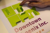 indsay Kinkade, founder of Design RePublic, joined the team to match the aesthetics to the mission.
With a studio workspace on Grand Avenue and decades of experience as an urban-focused designer and strategist, she was a natural fit for the project.
She’s “embedded” in the Downtown community, according to Krietor, connected to what’s happening on the ground through artistic outreach and development projects of her own.
So rather than hire a public relations firm outside the city or state, tapping a great local talent like Kinkade with “inside” expertise created the engaged, hands-on, publicly transparent rebranding process the organization needed.
After researching 25 years of the partnership’s public-facing persona, interviewing stakeholders and engaging in public dialogue on the future of the organization and its affiliates, Kinkade found her inspiration: doors and windows.
Opening a door or finding a window is about welcoming change, seizing opportunities and finding solutions. With this idea in mind, a grid-based typeface emerged that could be rearranged in multiple ways and contained three-dimensional flaps which resembled opening doors and windows, as if inviting the viewer inside and saying, “welcome.”
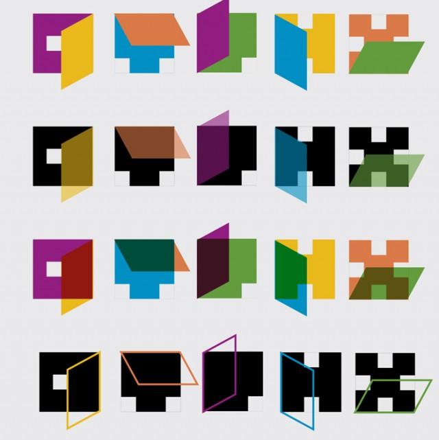 “It’s very specifically designed to be a system and not just a fixed identity logo that gets stamped on things,” Kinkade said. “It’s designed to grow and change and move because that’s what DPI does.”
While the logo is fun, colorful and modern, there’s a deep-seated message behind it, with enough breadth and flexibility to take the organization into the future.
“The focus on doors and windows was to say that we need to be a more open place, we need to collect more ideas and we need to be open to diverse opinions about what Downtown can be,” said Dave Krietor. “I think it’s incredibly symbolic of where we’re headed.”
As the new identity slowly rolls out, big changes can be expected, including a revamped website with improved features and amenities.
* Bottom illustration depicts an early version of the grid-based system created during the design process, illustrating the flexibility and playfulness of the typeface. Courtesy of Lindsay Kinkade, Design RePublic.


 indsay Kinkade
 “It’s very specifically designed to be a system and not just a fixed identity logo that gets stamped on things,” Kinkade said. “It’s designed to grow and change and move because that’s what DPI does.”